Beyond a Dashboard Tile
Role
UX Designer
Duration
2 months
Impact
Reimagined path from high-level performance trends to actionable insights across 100+ data points.
Project Overview
As a new contractual period approached, our client sought to redesign one of the most heavily used components in their dashboard. Over time, a simple dashboard tile had evolved into a dense report card that relied on institutional knowledge to interpret. With frequent staff turnover, that expertise could not always be assumed. The challenge was creating an experience that helped users quickly identify meaningful trends, understand their implications, and confidently communicate insights.
The Problem

Lost in Translation

My project manager approached the design team after hearing recurring feedback from the client: this particular dashboard tile was not intuitive. Its primary users worked in roles with frequent staff turnover, meaning new employees often struggled to locate and interpret the information needed for presentations. Existing dashboard tiles attempted to satisfy many different reporting needs within a limited amount of screen space. This one was no different.

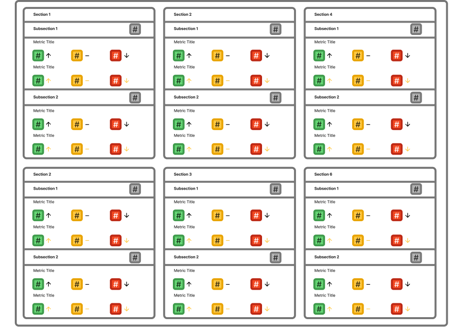
6

Months

Average employee tenure, resulting in frequent knowledge transfer challenges.

6

Performance Sections

Distinct areas of organizational performance summarized within the dashboard tile.

3

Layers of Interpretation

Every metric required users to interpret a value, status indicator, and trend simultaneously.

100+

Data Points

Individual performance values presented across summary and drill-down views, requiring users to synthesize information across multiple categories.
The Challenge

Delivering Confidence, Not Just Data

As a result, our project manager saw this as an opportunity to reinvent the dashboard tile experience. Users relied on its data in preparation for recurring meetings, which raised an important question:

How might we help new employees quickly understand and communicate insights without relying on institutional knowledge?

Goal #1: Reduce Reliance
Help new users understand data without requiring years of experience.
Goal #2: Improve Findability
Create a clearer path from high-level trends to specific insights.
Goal #3: Balance Breadth and Depth
Preserve reporting detail while making insights easier to interpret.
The Process

Connecting the Dots and Other Indicators

Before exploring solutions, I needed to understand why this dashboard tile had become difficult to use. After speaking to the Product Owner and conducting an analysis, I discovered the challenge wasn't visual design alone. The tile had gradually evolved into a complex report card that required users to navigate dense data, interpret multiple visual cues, and prepare presentation-ready insights—all within a single interface.
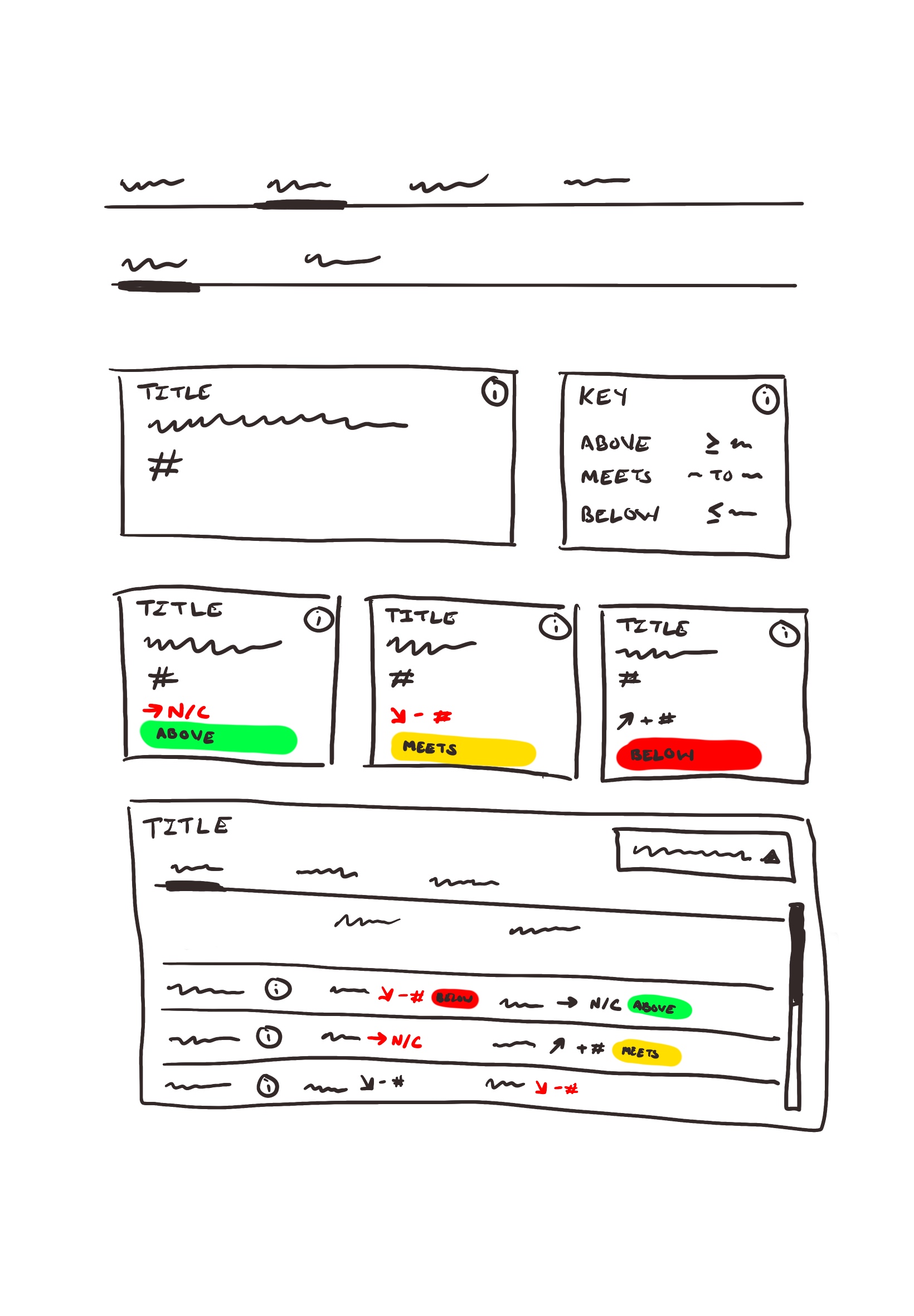
Mid-fi recreation of the initial view of the dashboard tile before the user interacted with it.
UX Consideration
Questions
Why does it matter?
Usability
What information is the most important for users?
If every metric competes equally for attention, users have to decide what matters instead of the interface helping them prioritize.
Workflow
How is the data used by users outside of the dashboard?
Understanding what happened after someone viewed the dashboard helped determine whether the experience should support monitoring, reporting, presentations, or all three.
Interactions
What is clickable?
What is hoverable?
Users can't benefit from functionality they don't realize exists. I wanted to understand whether interactive elements were obvious or depended on prior knowledge.
Semantics
What is the meaning of each color?What is the meaning of the direction of each arrow?
The dashboard relied heavily on visual cues. I needed to understand whether those cues were immediately meaningful or required domain expertise.
Accessibility
Shouldn't icon colors have a stronger contrast with the background color?
Some interface elements relied on subtle color differences that reduced visibility and could make important information harder to perceive.
Visibility
How much did a line item change?
What defines a positive or negative trend?
Are users overwhelmed with too many metrics?
Understanding change is only valuable if users can quickly determine whether it requires action. I wanted to understand whether the dashboard highlighted meaningful trends or simply displayed large amounts of data.
Designing a Solution

Exploring Different Routes

A single problem rarely has a single answer. Before settling on a direction, we explored several approaches that balanced clarity, familiarity, and information density. Rather than continuing to optimize the tile itself, I found myself exploring whether its experience should be redesigned into something new altogether.

We went forward with the customizable dashboard approach (concept #3) because it preserved the existing user experience while allowing users to prioritize information relevant to their role.
Concept 1:
Bigger Visuals
What if we simply improved legibility while preserving the existing dashboard?
Pros: Easier to read.
Cons:
Still difficult to interpret.
Concept 2:
Vertical Dashboard
What if users progressively revealed information instead of seeing everything at once?
Pros: Better hierarchy.
Cons: Too many clicks.
Concept 3:
Custom Dashboard
What if the dashboard changed based on what each user needed?
Pros: Familiar; flexible; faster to find information.
The Solution

Answer Key

Rather than asking users to adapt to a complex reporting tool, the redesign adapted to the way users actually worked. The final concept preserved the familiarity of the existing dashboard while creating a clearer path from high-level performance trends to detailed insights. By allowing users to customize the information most relevant to them, the experience reduced reliance on institutional knowledge without sacrificing the depth of reporting.
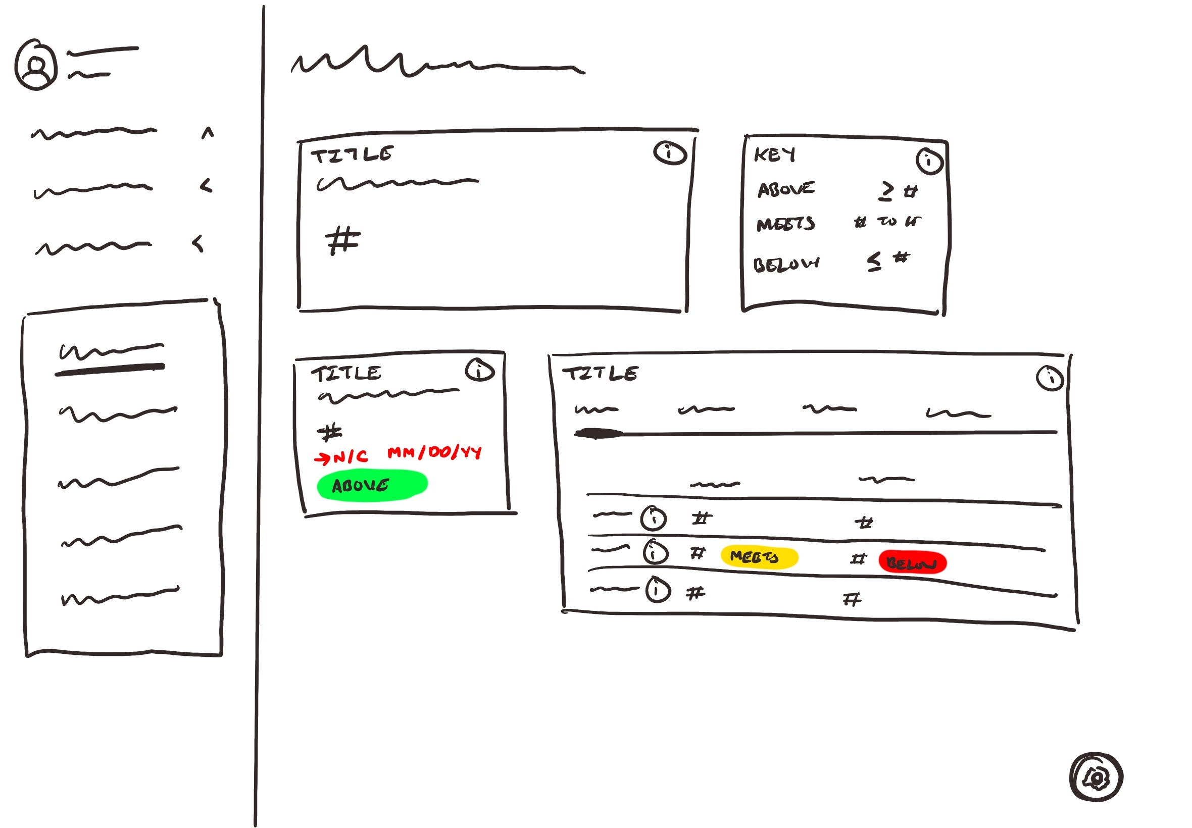
Lo-fi concept of the final design, which enables users to disply what information pertains to them while simultaneously providing additional context.
Reflections

Personal Musings

This project ultimately changed how I approach redesign requests. Rather than immediately focusing on the interface, I found myself spending more time understanding the workflows surrounding it. As conversations with the Product Owner uncovered how the dashboard was actually used, the effort shifted from optimizing a single component to improving how users discovered, interpreted, and communicated information. The result wasn't just a dashboard—it was a solution grounded in the way people actually worked.

Asked to redesign a dashboard tile?

Sometimes it's worth stepping outside the box you were asked to redesign.

But wait, there's more!

Check out other examples of how I turned complexity into clarity.

UX Research | Data Visualization

Simplifying Organ Transplant Data Insights

Turned complex organ transplant performance data into intuitive dashboards, reducing the time to uncover actionable insights from days to minutes.

View Project

Facilitation | Design Systems

Scaling Design System Knowledge Across a Design Practice

Led an organization-wide workshop that brought designers together to align on best practices. Shared lessons learned from developing a design system to improve accessibility, inclusivity, and scalability.

View Project

Primary illustrations by absurd.design
Additional illustrations by Alex Muravev, Olga, and Tatyana from the Noun Project.