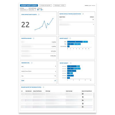
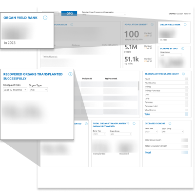
Simplifying Organ Transplant Data Insights
Role
UX Designer & Researcher
Duration
12 months
Impact
Reduced reporting time from days to minutes; surfaced 50+ actionable insights; recognized with internal award.
Project Overview
Thousands of people in the United States die every year waiting for an organ transplant, with thousands more usable organs discarded. And the public have noticed. Rather than remaining stagnant, our client sought to modernize their oversight processes. While our project wasn't focused on clinical care itself, it supported the oversight teams responsible for monitoring the broader transplant system. The challenge was designing a platform that could help employees monitor hundreds of partner organizations with confidence.
The Problem

Bitter Pill to Swallow

Our client was modernizing oversight workflows across a large, federally regulated healthcare network. Existing systems required employees to piece together information from multiple sources, creating unnecessary effort and slowing decision-making. According to publicly available data, in 2023...

50,326

Patients Waitlisted

Total number of patients waiting for at least one organ transplant.

10,576

Organs Discarded

Total number of usable organs that were discarded that otherwise could have been used to save a life.

5,224

Patients Died

Total number of patients who died on the waiting for an organ transplant.

The Challenge

Get in Shape

As a result, our client sought to modernize their oversight processes. More often than not, decisions in the health sector are quick yet demand precision across the nation, which led us to ask:

How might we help oversight teams monitor hundreds of partner organizations more efficiently?

Goal #1: Alleviate Burdens
Employees responsible for monitoring hundreds of member organizations were exhausted. Relationships between them, transplant hospitals, and organ procurement centers were complicated and strained.
Goal #2: Expedite Decisions
Retrieving information took time that otherwise could be allocated to other mission-critical tasks. Data was stored in various locations, resulting in multiple touchpoints.
Goal #3: Improve Oversight
While the client's broader mission is to strengthen the organ donation and transplant system, our team's contribution focused on improving the day-to-day tools that oversight teams rely on to make informed decisions.
The Process

Lean, Not Mean, Iterating Machine

We approached this project leveraging a lean UX process, emphasizing on rapid iteration and validations while maintaining a close collaboration with stakeholders. This allowed us to adjust quickly and deliver solutions that aligned with both user needs and project goals.
This diagram illustrates our iterative design process. I led core aspects of the design and research process, from synthesizing user insights into deliverables to rapidly designing solutions and facilitating co-creation sessions.
The Solution

Answer Key

Our research uncovered the complex yet dependent relationships between oversight teams and partner organizations. Rather than looking to further divide these entities, we worked to dismantle their respective silos with the solution outlined below.

Modernized Approach

Given existing enterprise tooling and strict data security requirements, we embedded data visualizations within the client’s internal platform—balancing usability, compliance, and scalability.
Two mobile mockups.

Consolidated Data

We unified data from spreadsheets, legacy systems, and external sources into a single experience.
Two mobile mockups.

50+ Insight Cards

We surfaced 50+ actionable insights designed around high-frequency oversight decisions, with accessibility standards applied across all visualizations.
Two mobile mockups.
My Role

Fit For a King

I worked as the end-to-end UX Designer and Researcher on this year-long engagement. I was empowered by two different Design Directors and a UX Lead and worked alongside a Senior Data Visualization Lead, SharePoint Developer, Business Analyst, and Project Manager.
This timeline illustrates key milestones and how the design team evolved throughout the project. I played a central role in maintaining continuity across both contract periods, helping the project team deliver value that led to consistent engagement with the client.
My Contributions

Let’s Do the Numbers

I completed two consecutive contract periods on this project and consistently delivered value for our client.

250+

Wireframes

I produced and iterated on wireframes to rapidly validate concepts and support MVP development.

1

Award Submission

I collaborated with the team on a submission for an internal company award, which won the category of Client Co-Innovation within our market unit.

1

Design System

I documented UI elements to ensure visual consistency of platform and expedite the turnaround of hi-fi designs for client review and development hand-off.

16

Co-Creation Sessions

I led all 16 co-creation sessions with primary and secondary users to inform design iterations and validate decisions.

6

User Personas

I synthesized research findings from user interviews to generate 6 user personas and other strategic insights.

1

Application Map

I organized the information architecture of the platform into an application map.

Phase I

Discovering & Uncovering Information

This project started with a series of user interviews conducted in parallel with a review of process documentation across different client teams. Our research revealed that users across departments relied on the same data for their work but operated in silos. Information was scattered across spreadsheets, external websites, and homegrown tools, making data retrieval inconsistent and time-consuming. This led us to prioritize a unified information architecture.

We have a societal responsibility if critical resources are being offered to us and we're saying no. There's an opportunity there. I think utilizing that data—and everything before this—is really powerful.

Primary User

From these insights, I generated 6 user personas to capture distinct needs and pain points expressed during the sessions. I also designed initial wireframes and proposed an application map to unify data in one centralized application, organizing clearly how users would navigate and interact with the platform. I presented these to the client as artifacts of understanding the user and where we could go.
Lo-fi concepts I mocked up that aligned to user pain points, which were shared with the client to demonstrate early design thinking and inform the next phase of the contract. These, alongside the user personas and application map I also created (not pictured), helped validate our approach and extend the period of performance.
Phase II

All Wired Up

With prior deliverables in one hand and a new period of performance in the other, I felt eager to maintain the team's momentum. We entered a rapid iteration loop where designs were continuously showcased in client reviews. Each round fed directly into changes, blurring the lines between formal research and validation. Not only did this allow the client to visualize the solution before implementation, but it also ensured what was implemented truly delivered value. These sessions shifted design reviews from approval checkpoints into collaborative problem-solving conversations, accelerating alignment and reducing rework.
One of 16 client co-creation sessions I facilitated remotely with key stakeholders and other members of the design team. This was part of our iteration cycle to regularly gather input and align design direction.
Recieved Feedback

Validated & Celebrated

Throughout our co-creation sessions, we consistently received positive feedback from both users and key client stakeholders. Users shared that the application could significantly reduce reporting time and help them quickly identify data anomalies—something they hadn’t been able to do before. Stakeholders also expressed that the solution was exactly what they’d been hoping for.

This is fantastic. This takes our reporting time down from what could be a couple of days to a matter of minutes. Honestly, this saves us so much trouble and so much reduction in possible human error.

Primary User

This is absolutely sensational. It is absolutely fantastic. I am using it in my day-to-day today to support a lot of different initiatives. It shows a little interesting data anomaly that I would have never known without a graphic like this. But very interesting takeaways. I don’t have any suggestions which does not usually happen with me, but I love this. This is fantastic.

Primary User

The designs have been good, they have been informative and challenge old-school thinking. They have been going well.

Key Client Stakeholder

This is great. This is right on target of what we’re looking for!

Key Client Stakeholder
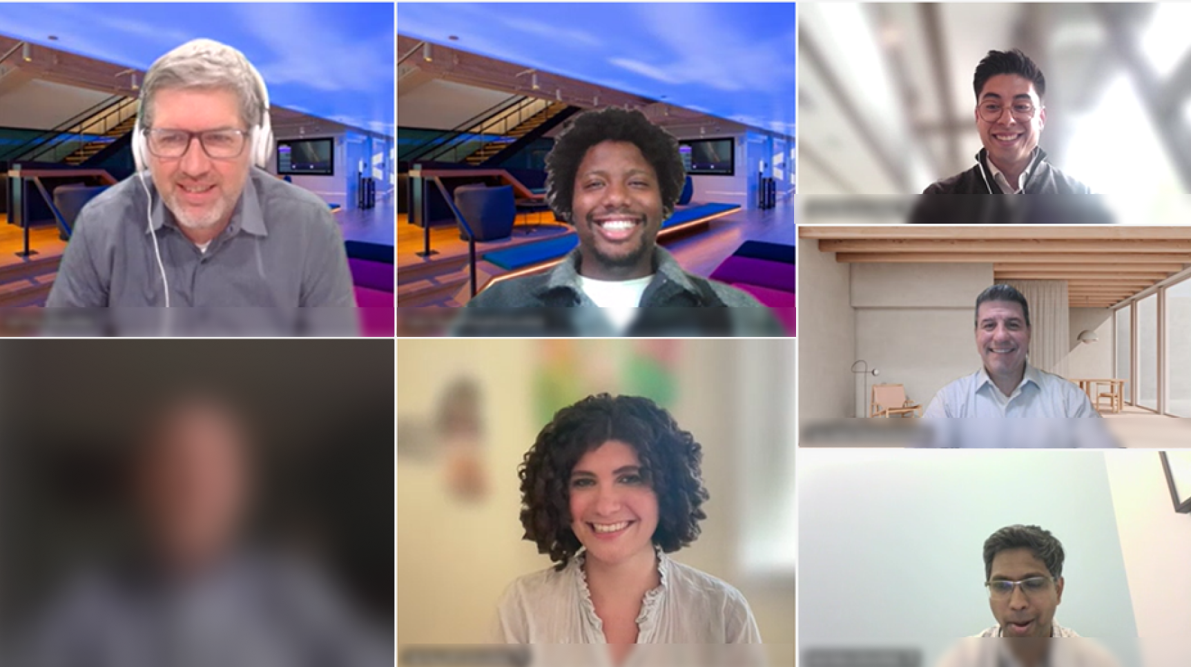
Beyond the strong feedback we received, this project was also recognized through a company-wide award program that celebrates excellence across the value chain, from strategy and design to delivery and measurable business impact. Winning the award within our market unit affirmed not only the strength of our solutions, but also the proactive approach we took: working closely with our client to build something both impactful and scalable together. It also helped raise the visibility of human-centered design across different accounts within the company.
Some of the project team just before virtually presenting our work for award consideration, which ended up being an energizing moment enabling reflection on the creativity, collaboration, and client partnership that defined our work.
Reflections

Personal Musings

This project ultimately changed how I approach stakeholder alignment. By the time I was halfway through my 16 co-creation sessions, I found myself relying less on predefined requirements and more on facilitating productive conversations. As participants built on one another's ideas, design reviews shifted from client approvals into collaborative working sessions. The result wasn't just better designs: it was stronger alignment, faster decisions, and greater confidence in the direction we were taking.

Working in the federal space may be percieved as unglamorous but contributing to work that helps save lives?

That's as good as it gets.

But wait, there's more!

Check out other examples of how I turned complexity into clarity.

Product Design | Workflow Design

Beyond a Dashboard Tile

Reimagined a single dashboard tile into a workflow to eliminate reliance on institutional knowledge.

View Project

Facilitation | Design Systems

Scaling Design System Knowledge Across a Design Practice

Led an organization-wide workshop that brought designers together to align on best practices. Shared lessons learned from developing a design system to improve accessibility, inclusivity, and scalability.

View Project

Primary illustrations by absurd.design
Additional illustrations by Alex Muravev, Olga, and Tatyana from the Noun Project.